Mittwoch, 12. Oktober 2016
29.09.2016 First class
ramonarichert12094, 12:15h
At the first class some ordinary topics were explained. I learned that for data visualization an algorithm creates graphics by data. In contrast to data visualization a designer creates info graphics manually by data. Data visualizations or info graphics have to give visual properties that the viewer gets and understands the data and their information in a short time. Values of the visualization can be the color, position, orientation, size, width or width. But data visualization can have some difficulties. For example, integrity can be a problem.
We started to use “Processing” as a visualization tool. In my bachelor degree I already worked with Processing. So I could use the lesson as refresh of my skills. We teamed up and get a table with some data of the Titanic. In the group we discussed which information could be important so that they have to be visualized. After we chose the values we thought about how to realize the information in a useful way.
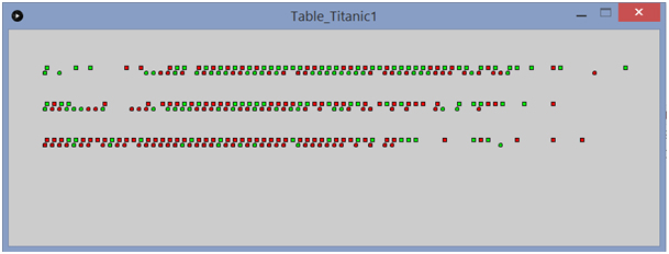
Figure 1: First visualization
Figure one demonstrates our first visualization. It includes information about the passengers of the titanic: the class, the age, the sex and the information if a passenger survived or not. The rows offer the class, first class second class and third class. The rectangles show males and the circles females. When the color of an object is red, it means that the person died. The green color offers that the person survived the accident. The people are sorted by their age. The youngest people are on the left side and the oldest on the right.
We started to use “Processing” as a visualization tool. In my bachelor degree I already worked with Processing. So I could use the lesson as refresh of my skills. We teamed up and get a table with some data of the Titanic. In the group we discussed which information could be important so that they have to be visualized. After we chose the values we thought about how to realize the information in a useful way.
Figure 1: First visualization
Figure one demonstrates our first visualization. It includes information about the passengers of the titanic: the class, the age, the sex and the information if a passenger survived or not. The rows offer the class, first class second class and third class. The rectangles show males and the circles females. When the color of an object is red, it means that the person died. The green color offers that the person survived the accident. The people are sorted by their age. The youngest people are on the left side and the oldest on the right.
... link (0 Kommentare) ... comment